

Why Most Leaders Are Still Flying Blind in 2026
Most manufacturing leaders are making million-dollar decisions using last week's data. That’s not a leadership problem. That’s a dashboard problem.
Your instinct built the business. But in 2026, instinct alone isn’t enough. According to Gartner, 90% of business leaders will depend on AI-generated insights by 2026. The ones already there?
They’re not smarter. They just see faster.
The Shift: From Data Overload to Decision Clarity
Most dashboards today fail for one simple reason:
They show data. They don’t drive decisions.
The ideal AI dashboard does one thing exceptionally well: It tells you what matters - instantly.
Let’s break down what that looks like.
1. Plant Health Score → One Number. One Truth.
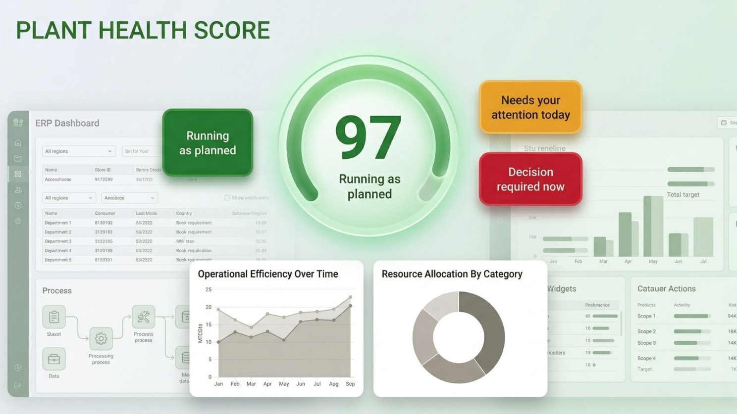
Forget 40+ metrics.
You need:
A single score
A single colour
A single signal
Green → Everything is on track Amber → Attention needed Red → Immediate decision required
Companies using strong data visualization:
5× faster decision-making
3× better execution
The best dashboards don’t give more data. They give clarity.
2. OEE (Overall Equipment Effectiveness) → Hidden Capacity
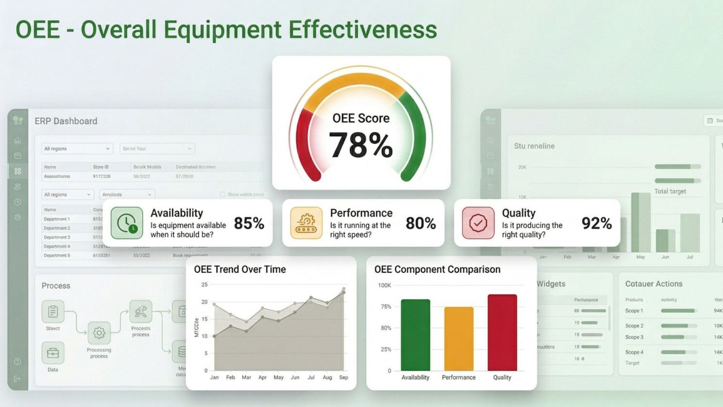
This is the heartbeat of your plant.
It answers:
Is equipment available?
Is it running at optimal speed?
Is output quality consistent?
Benchmark:
World-class OEE → 85%
Industry average → ~60%
That 25% gap?
That’s unused capacity you’ve already paid for.
AI helps you pinpoint:
Which machine
Which shift
Which line
No guessing. Just action.
3. Downtime Tracker → From Reactive to Predictive
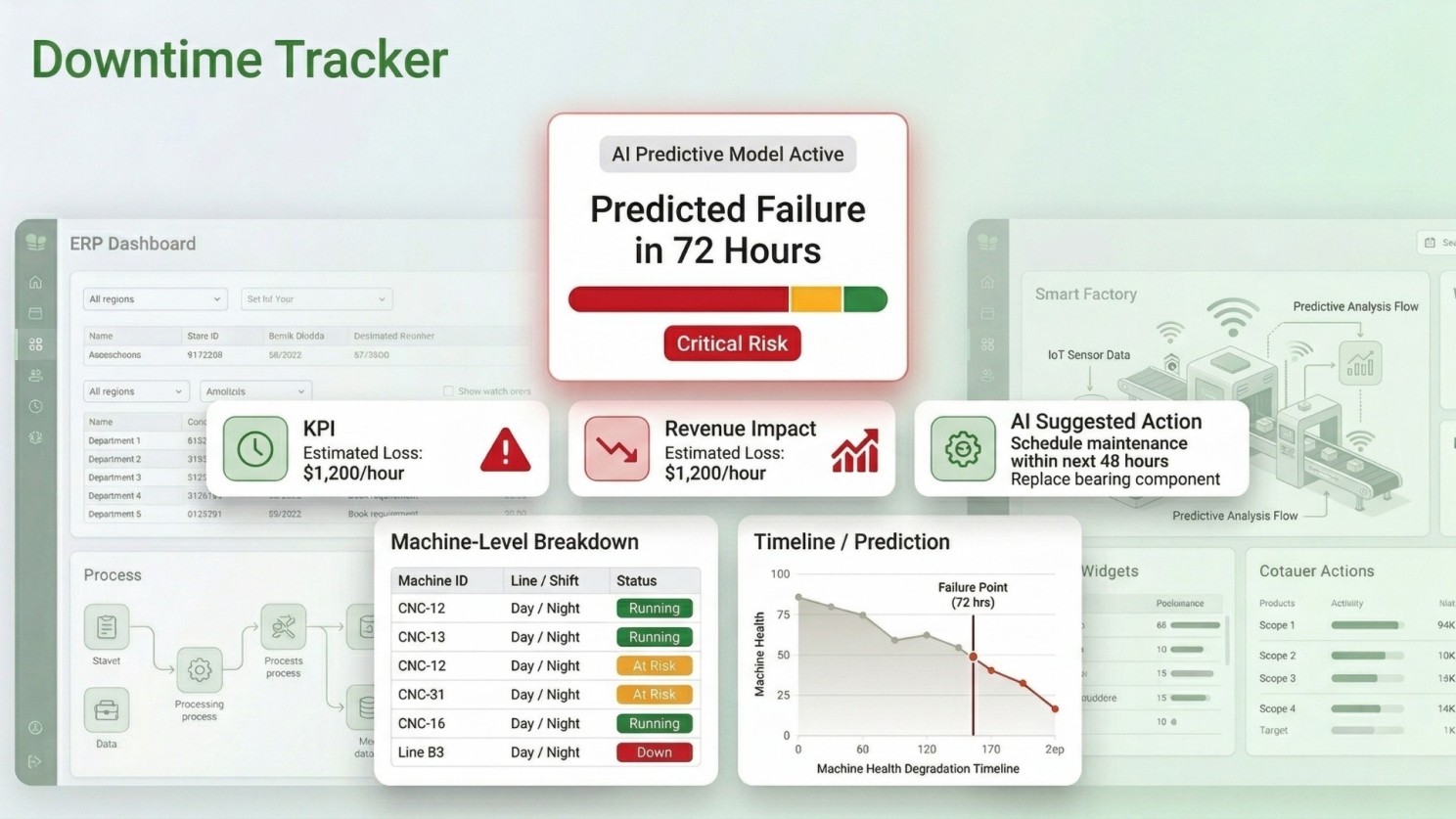
Old way: You discover downtime in weekly meetings.
AI way: You see it:
As it happens
Before it happens
AI predicts failures up to 72 hours in advance, showing:
Machine + line + shift
Revenue impact per hour
Recommended action
Result:
Up to 25% reduction in unplanned downtime
That’s not just operational efficiency. That’s direct profit impact.
4. Inventory & Supply Chain Pulse → No More Surprises
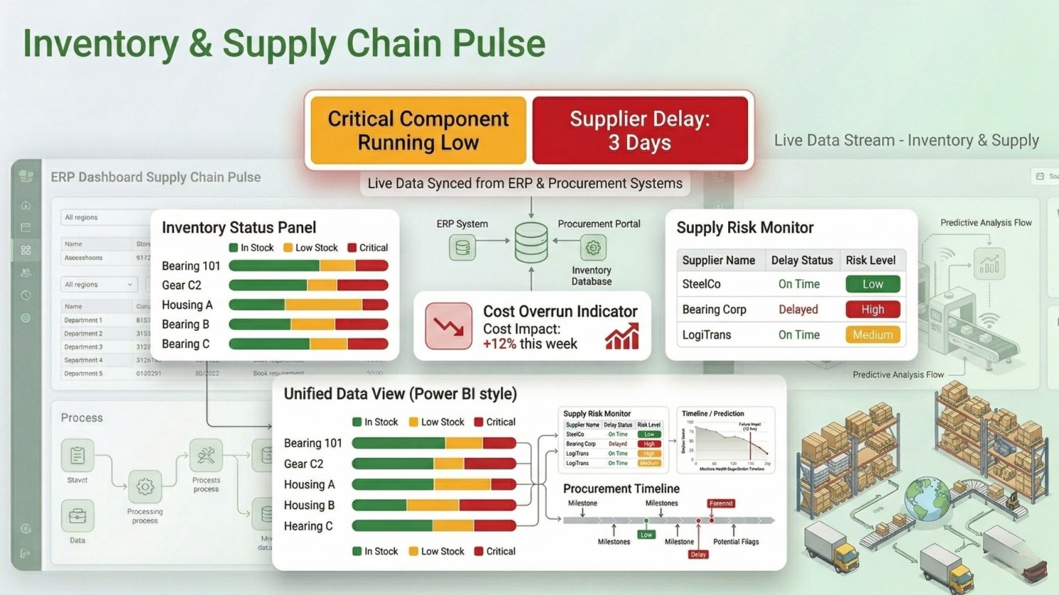
Production doesn’t fail on the shop floor. It fails in the supply chain.
Your dashboard should show:
Material shortages (before they hit)
Supplier delays
Cost fluctuations
Integrated systems (ERP + procurement + inventory) give:
Real-time visibility
Early risk detection
Better planning decisions
No more:
“We didn’t know stock was low.”
5. Financial Performance → Where Most Dashboards Fail
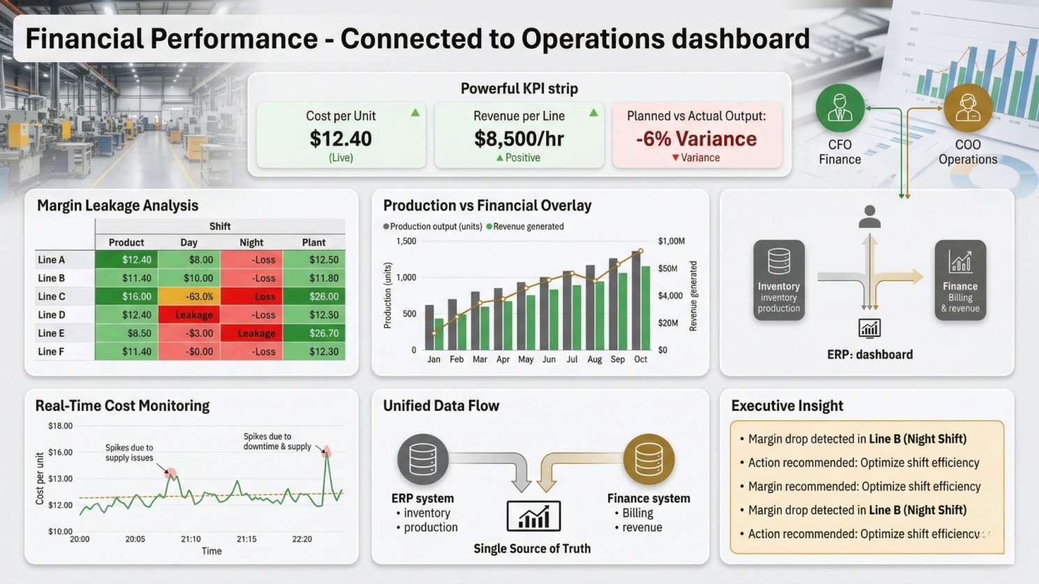
Most dashboards separate:
Finance
Operations
That’s a mistake.
The ideal dashboard connects both:
Cost per unit (live)
Revenue per line
Planned vs actual output
Margin leakage (by shift/product/plant)
When finance and operations align:
Decisions become faster
Errors reduce
Leadership alignment improves
6. On-Time Delivery → The Only Metric That Matters to Customers
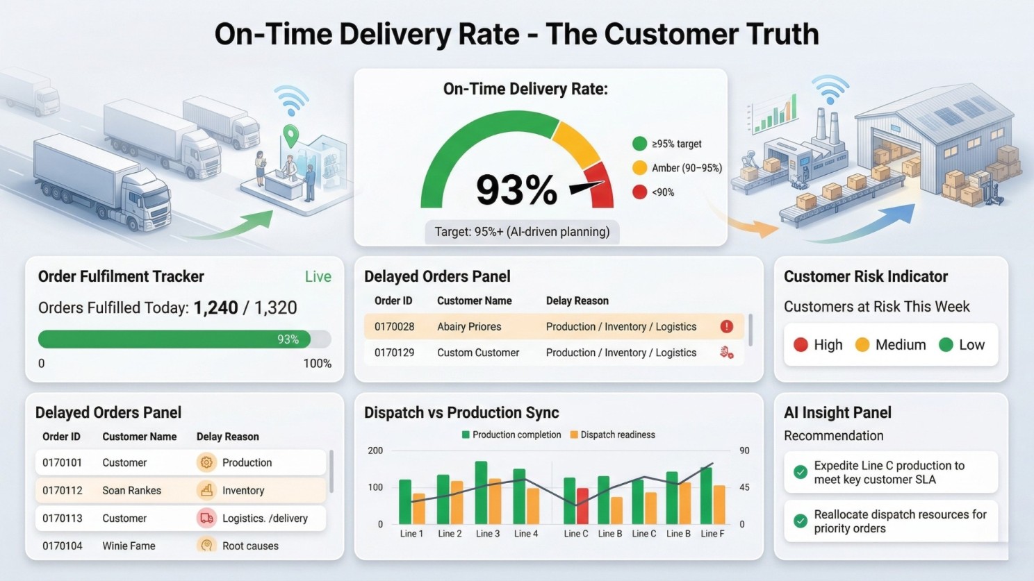
Everything leads to this:
Did the customer receive their order on time?
Track:
Order fulfilment rate
Delays + root causes
At-risk customers
Dispatch vs production sync
By 2027:
Top manufacturers aim for 95%+ fulfilment rates
This isn’t logistics.
This is revenue protection.
7. Copilot Layer → Ask Your Data Anything
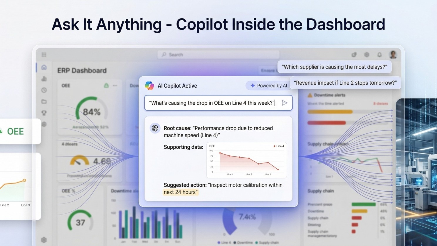
This is where dashboards evolve into decision engines.
Instead of searching across tools, you simply ask:
“Why did OEE drop this week?”
“Which supplier is causing delays?”
“What’s the revenue impact if Line 2 stops?”
AI responds instantly:
Explains the issue
Identifies root cause
Suggests next steps
No analyst. No Excel. No delay.
The Ideal AI Dashboard (At a Glance)
Your entire business — on one screen:
Plant Health Score → Instant clarity
OEE → Capacity insights
Downtime Tracker → Predictive alerts
Inventory Pulse → Supply chain visibility
Financial View → Unified performance
Delivery Metrics → Customer truth
Copilot Layer → Decision intelligence
All:
Real-time
Connected
Actionable
The Real Problem Isn’t Technology
Here’s the uncomfortable truth:
41% of leaders still can’t use their dashboards effectively.
Why? Because:
Data is too complex
Insights are not actionable
Systems aren’t connected
The Bottom Line
The best dashboard doesn’t need an explanation.
It explains itself.
And the real shift happens when your team stops asking:
“Can someone pull that report?”
And starts asking:
“What should we do next?”
That’s when your dashboard stops being a tool - and becomes a competitive advantage.
This is the heartbeat of your plant.
It answers:
Is equipment available?
Is it running at optimal speed?
Is output quality consistent?
Benchmark:
World-class OEE → 85%
Industry average → ~60%
That 25% gap?
That’s unused capacity you’ve already paid for.
AI helps you pinpoint:
Which machine
Which shift
Which line
No guessing. Just action.
3. Downtime Tracker → From Reactive to Predictive
Old way: You discover downtime in weekly meetings.
AI way: You see it:
As it happens
Before it happens
AI predicts failures up to 72 hours in advance, showing:
Machine + line + shift
Revenue impact per hour
Recommended action
Result:
Up to 25% reduction in unplanned downtime
That’s not just operational efficiency. That’s direct profit impact.
4. Inventory & Supply Chain Pulse → No More Surprises
Production doesn’t fail on the shop floor. It fails in the supply chain.
Your dashboard should show:
Material shortages (before they hit)
Supplier delays
Cost fluctuations
Integrated systems (ERP + procurement + inventory) give:
Real-time visibility
Early risk detection
Better planning decisions
No more:
“We didn’t know stock was low.”
5. Financial Performance → Where Most Dashboards Fail
Most dashboards separate:
Finance
Operations
That’s a mistake.
The ideal dashboard connects both:
Cost per unit (live)
Revenue per line
Planned vs actual output
Margin leakage (by shift/product/plant)
When finance and operations align:
Decisions become faster
Errors reduce
Leadership alignment improves
6. On-Time Delivery → The Only Metric That Matters to Customers
Everything leads to this:
Did the customer receive their order on time?
Track:
Order fulfilment rate
Delays + root causes
At-risk customers
Dispatch vs production sync
By 2027:
Top manufacturers aim for 95%+ fulfilment rates
This isn’t logistics.
This is revenue protection.
7. Copilot Layer → Ask Your Data Anything
This is where dashboards evolve into decision engines.
Instead of searching across tools, you simply ask:
“Why did OEE drop this week?”
“Which supplier is causing delays?”
“What’s the revenue impact if Line 2 stops?”
AI responds instantly:
Explains the issue
Identifies root cause
Suggests next steps
No analyst. No Excel. No delay.
The Ideal AI Dashboard (At a Glance)
Your entire business — on one screen:
Plant Health Score → Instant clarity
OEE → Capacity insights
Downtime Tracker → Predictive alerts
Inventory Pulse → Supply chain visibility
Financial View → Unified performance
Delivery Metrics → Customer truth
Copilot Layer → Decision intelligence
All:
Real-time
Connected
Actionable
The Real Problem Isn’t Technology
Here’s the uncomfortable truth:
41% of leaders still can’t use their dashboards effectively.
Why? Because:
Data is too complex
Insights are not actionable
Systems aren’t connected
The Bottom Line
The best dashboard doesn’t need explanation.
It explains itself.
And the real shift happens when your team stops asking:
“Can someone pull that report?”
And starts asking:
“What should we do next?”
That’s when your dashboard stops being a tool - and becomes a competitive advantage.
--
Author: Kirit Mandavgane, Chief Strategy Officer at NSquare Xperts
A seasoned Microsoft technology strategist specializing in Microsoft Dynamics 365, the Microsoft Power Platform, and Microsoft Copilot. He advises organizations on CRM, ERP, automation, and AI initiatives, helping them accelerate digital transformation and achieve measurable business outcomes.